Here's the complete transcript of my 2012 interview with Marija Matešić, freelance digital analyst and strategist from Croatia, which appears in her new e-book Infographics Through Samples, available here.
- - - -
Would you like to introduce yourself? How did you become interested in information graphics?
I am a 25-year veteran of the newspaper business. I began my career at the Montgomery Advertiser in Montgomery, Alabama in the 1980s as an illustrator and news artist and was in on the ground floor of the Macintosh revolution in newspaper graphics. I like to think that the news graphics business and I have grown up together.
- - - -
Who influenced your work and what was the most exciting project you've been working on?
I am primarily a product of the great Philadelphia Inquirer news art department of the mid- to late 1990s. Much of that department has now gone on to form the core of the current New York Times and San Diego Union-Tribune graphics departments. The colleagues who have mainly inspired and influenced my work are Bill Marsh and Matt Ericson of the Times, John Duchneskie and Kevin Burkett of the Inquirer, Michael Price at the Union-Tribune — although this list leaves out many important names as well. I have also drawn inspiration from the diagrammatic work of Stephen Biesty and David MacAulay.
I was called upon to use just about every skill I have in our recent retrospective on the 50th anniversary of John Glenn's orbital spaceflight aboard Friendship 7. I conducted a lengthy interview with Glenn himself, and then used information from that interview as well as many hours of independent research and reporting to explain the spacecraft and the flight in a full-page infographic and accompanying video.
- - - -
What would be the easiest way to explain information graphics? How does the creation process look like and which parties are usually involved?
Any visual display of information, number data or map information can be called (or made part of) an information graphic. There are many types of information that can be presented visually, and so there are many different types of information graphics. These mainly break down into three types: Cartography (maps,) charts, and my own particular specialty, diagrammatic graphics.
In a newspaper newsroom, an information graphic begins with a visuals editor seeing a story and identifying which parts of that story can best be told visually. And there is almost always some aspect of the story that will benefit from visual storytelling.
At that point, a news artist is assigned and gets together with the reporter on the story. The two work closely together to make sure that the written story and the visual agree and complement each other. Many times, especially with stand-alone graphics (graphics that run on their own, without an accompanying story), the news artist IS the reporter.
The news artist then coordinates with the page designer (and online editors) to fine-tune the completed presentation, so the graphic works with the layout, the photos etc. as a coordinated package.
- - - -
How would you explain "infographic madness" on the web lately?
News presentation was already moving in a visual direction - more graphics, smarter use of graphics - when the bottom fell out of the print newspaper business in the early 2000s. Readers were becoming accustomed to seeing information presented visually and were already getting out of the habit of wading through long-form written narratives. Graphics pioneers such as TIME magazine's great Nigel Holmes and Joe Lertola, among many others, had demonstrated how efficiently and authoritatively information could be presented in a graphic form.
There's been a huge recent proliferation of free online tools, tutorials and examples that makes it easier than ever for almost anyone to begin exploring this new medium. It's accessible and inviting - a good-looking graphic piques a viewer's curiosity and may keep him or her on the web site longer.
- - - -
Could you give your professional advice as an information graphics expert to tower infographics creators?
A slick, professional-looking information graphic is a very convincing thing. It is hard for many people to think that visuals can lie or be mistaken. It's therefore very easy for someone to slant a story, present deceptive or inaccurate information, deliberately or by mistake, and have web viewers accept it, re-post it, re-Tweet it.
But the average website does not come with a lot of built-in credibility.
If the New York Times, for example, publishes an error in a graphic, yes, a lot of people may believe the error because it's coming from the New York Times. And that's bad. But the Times will then go to great lengths to correct the error. And that correction carries the same weight of credibility as any other New York Times reporting. Readers know that Times news artists are held accountable for what they publish.
A normal web site does not enjoy this measure of public trust. Once one of their graphics is shown to be incorrect, or deceptive in some way — why would a reader ever trust that web site again? Word of mouth travels very fast, and the damage to the site's credibility could be permanent.
- - - -
What are the main criteria according to which tower infographics would be accepted by experts in this field?
- Clear citing of sources
- Clear explanation of what overall point the graphic is trying to make
- Visual taste and restraint and proper use of graphic devices (using bar charts vs. fever charts where appropriate etc.)
I'm inherently suspicious of anything being communicated to me visually unless I can clearly see who's doing the communicating and whether I'm being told the whole story. If I suspect a web site is manipulating me in some way, they've lost me forever.
- - - -
What is your vision of the future of digital infographics?
With greater technical sophistication will come a greater ability for the viewer to design his own experience within an interactive information graphic. You can see some examples of this online today, and when it works well it is an ideal model for the future of online visual journalism.
An interactive graphic can present a tremendous amount of information, the equivalent of pages and pages of a print newspaper, and can do so in an easily digestible form, IF the graphic is smartly designed to
- guide the viewer through it,
- make him curious about it,
- allow him some control over how the information is presented, and
- welcome his feedback.
Publishing visual journalism in an electronic format on an iPad or tablet makes all this possible and opens up huge, exciting new vistas of opportunity for visual explanation and storytelling.
________
William Neff
www.williamneff.com

;) The video itself is long deleted, along with most of my work from the defunct Cleveland Plain Dealer that I didn't happen to save myself. It's really just as well: This was slow to the point of plodding, amateurishly produced using a home copy of Final Cut Express. I was mainly trying to demonstrate that graphic animations could be the basis for a news video.
The video itself is long deleted, along with most of my work from the defunct Cleveland Plain Dealer that I didn't happen to save myself. It's really just as well: This was slow to the point of plodding, amateurishly produced using a home copy of Final Cut Express. I was mainly trying to demonstrate that graphic animations could be the basis for a news video. William Neff
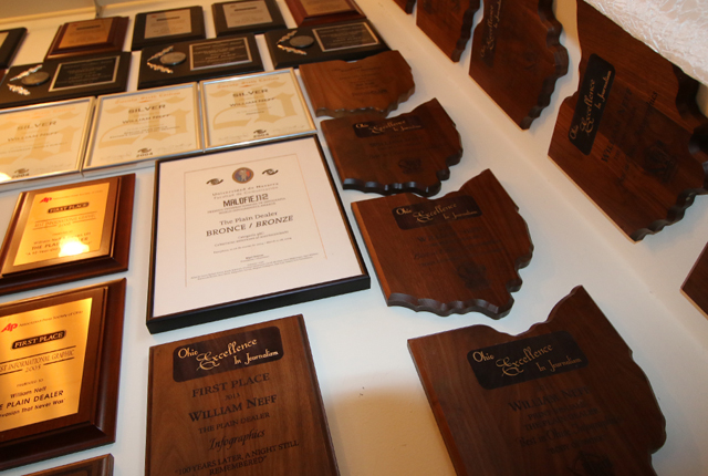
;)